
Measuring Return on Analytics
The Challenge: What Value Does Data Science Drive?
First of all, a note on scope and audience: this article has to do with marketing analytics/data science (I use the terms interchangeably), and is written as such. While these concepts should absolutely be useful for executives in other areas (biotech, manufacturing, operations, etc.), all of the specific examples are marketing-related. It’s also worth pointing out that this article is written with a management/executive audience in mind. Some of the concepts get technical, but not too technical. I try to provide concrete best practices and even algorithms to measure what analytics and data science actually get an enterprise in terms of financial results.
With that out of the way, there is a little talked-about challenge in these days of massive hype around data science—what does all this data, integration, instrumentation, and fancy modeling actually get me, as an executive allocating budgets? I have spoken to many CMOs who absolutely understand how critical marketing analytics is, but struggle to convince their peers in the C-Suite, or the Board, how specifically it will drive results.
This isn’t because analytics isn’t driving results; it’s because generally, these CMOs (or CROs, or VPs of Marketing Operations) haven’t put together a cohesive measurement framework. In fact, higher-level executives may understand why analytics is important, but they simply lack the vocabulary or frame of reference to ask the right questions to heads of analytics, data science, etc. This communication breakdown is common; McKinsey recently identified the role of the “analytics translator” as a must-have role to address this issue.
Measurement of analytics and data science is a classic case of “The Cobblers’ Children Have No Shoes.” Analytics is about data and measurement, so why should it actually think about measuring itself? It’s all very meta. Ignoring this issue, however, is increasingly becoming untenable. And, when the next recession hits—and it will—analytics and data science might find itself moving from a “golden child” with countless unfilled job openings to a “nice-to-have” utility that is fighting for dollars in the annual planning cycle.
With this in mind, I’ve laid out three concrete steps that heads of analytics or data science can start taking, now, to lay the groundwork to make analytics a truly measured function, with quantifiable benefits to the enterprise. As a bonus, putting these steps in place will help make the analytics function much more responsive to feedback, resulting in better performance.
Three Steps to Take to Start Tracking Return on Analytics
This article lays out three concrete steps that heads of analytics or data science can start taking, now, to lay the groundwork to make analytics a truly measured function, with quantifiable benefits to the enterprise. As a bonus, putting these steps in place will help make the analytics function much more responsive to feedback, resulting in better performance. This is based on observations of analytics departments and groups that have actually started to successfully measure the value they drive.
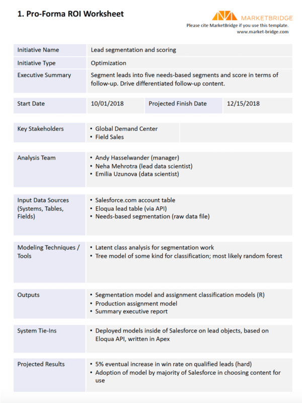
1. Setting the Goalposts: Start Each Analytics Engagement by Filling Out a “Pro Forma ROI” Form
At the outset of most every data science project, stakeholders, modelers, and data people all have a good idea of the goal. However, just like with any kind of coding, ignoring documentation leads to bad places. Writing down what you are trying to accomplish, and estimating how its effectiveness will be measured, puts the entire team on much better footing for success. This should be done before a single line of code is written or a query is executed.
The pro forma ROI form should have a few key components. First, a clear name for the project by which everyone can refer to it. Second, an executive summary of what is being done. Third—and here’s where the ROI comes in—the specific metric that the project is attempting to influence. For example, “increase lead conversion rate”, “increase new customer acquisition”, or “increase call center utilization rate.” It’s not enough to just specify the metric, however. It’s important to write down:
- Where the metric is coming from (the specific system(s), table(s), and field(s));
- What the current measured value is;
- The objective change to the metric (e.g., from 5% to 7%)
Some data scientists might object to writing down an objective for the change; it might be a W.A.G. or “wild-assed guess.” However, in my experience, these “WAGs” are wonderful to have around as reference points throughout the work. They clarify “what we thought success would look like.” If the achieved results are much lower, or non-existent, the team has a clear record of what didn’t work—which is just as important as a record of what did work. The image below shows a sample of this “pre-ROI worksheet.” Note that the entire worksheet can be downloaded at the bottom of the article as a PDF.

- Forcing yourself to say what you expect from a project is a valuable process.
2. The Feedback Loop: Post-Project Debriefs and Follow-Ups
It almost goes without saying that after the project is complete, a post-mortem should be conducted. But again, in so many analytics organizations we’ve seen, this isn’t really done, at least not systematically. It’s much more exciting for most people to rush to the next cool challenge, instead of slowing down for several hours or even days and taking stock of what was accomplished.
Here, the advantage of the pro forma ROI form is very apparent. It might have been weeks, months, or even over a year since the project commenced. What were the objectives again? What metrics did we say we were going to use to evaluate success? It is interesting to see how closely the project stayed to its original objectives. Keep in mind, veering off the original objectives isn’t a bad thing.
First, write down what the results of any models were. What was the lift identified in the validation set? Were there any in-market tests? What were those results? If the project wasn’t an optimization project, write down a summary of what was accomplished. How many segments were identified? What was the assignment rate? This should all be entered on a post-mortem form, similar to the Pro-forma form. This step can be done immediately upon completion of the work.
Second—and this is the tough part—call internal stakeholders two or three months after the work has been delivered, to understand exactly how it is being used, or how the models are performing. This is simply not done by most analytics managers or executives, but it has the single most important impact for the ongoing performance of analytics. By calling and seeing how the work is being used—and having an actual verbal conversation, with questions and answers and back and forth—the true learnings will emerge.
After doing the pro forma ROI, the initial project post-mortem, and collecting actual user feedback, managers can now begin collecting digestible, three-part project summaries. These summaries can be kept in a database format if you want to be fancy, but they can just as easily be documents (I prefer markdown). They can be put on a wiki, but they don’t have to be; they can be left in a Dropbox folder, too. The important thing is to do them.
3. Bringing it all Together: Build a Return-on-Analytics Dashboard
Having a wiki or a folder of analytics projects is a great start, but after a few of these have been done, it’s a great benefit to have an accessible summary of the “current value of analytics” to the company.
This is not a dashboard of all of the cool models and ROI calculations that have been created—piled together in one location. Rather, it is a systematic accounting of the benefits of those efforts, grouped by theme. Some of these benefits can be qualitative, but it’s better if most are quantitative. The dashboard should fit one page, perhaps with links back from the summarized statistics to the detailed project readouts—the three-part documents mentioned above. An example dashboard is shown in the image below:
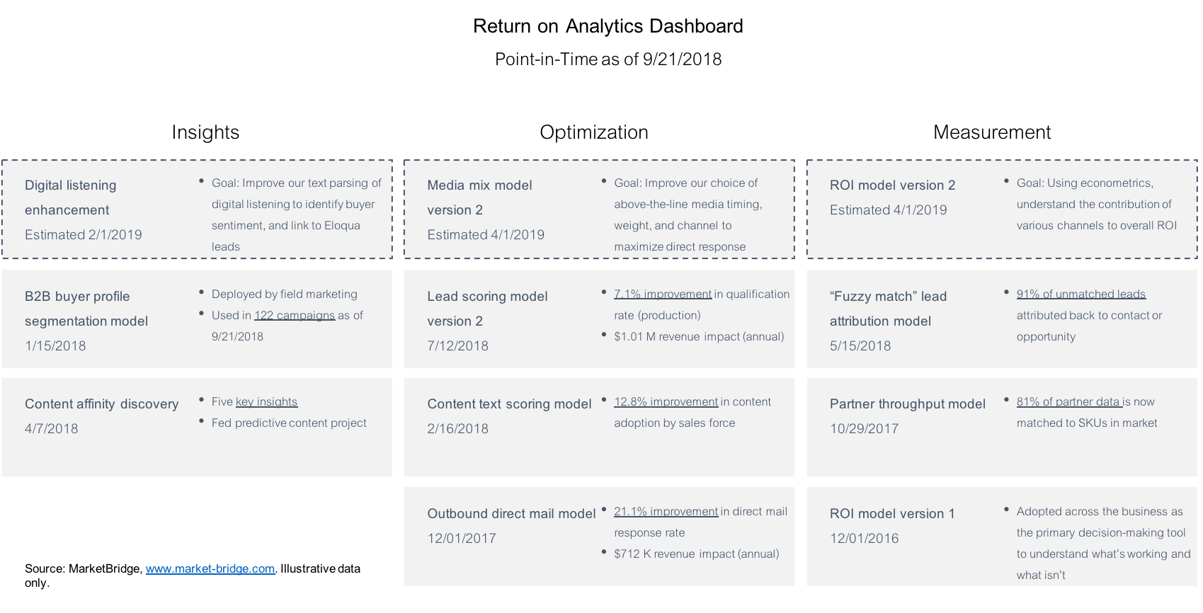
Ideally, the dashboard should be built on a reproducible stack, just like the analytics themselves should be (i.e., no click-and-drag dashboarding tools, instead use a code-based framework like D3 or Shiny for R.
In summary, the dashboard should be the single source of truth for the inevitable questions that come up around planning time “can you show me what analytics got us last year.”
This brings up an interesting question on timeframe. As any reporting specialist knows, a report on performance can either be in an “income statement” format (what did analytics deliver to the company in a timeframe, for example, one year), or in a “balance sheet” format (what is the current value of all of my analytics models and efforts). The simplest approach is the balance sheet approach. This is just a bubbled-up version of the three-part summaries, summed together. The income statement approach is more challenging because it requires a lot more analysis. To tackle this, you’ll need to estimate the collective performance of models over a time period. I suppose it’s possible to completely automate this, but it would be a big lift. I’d love to hear about anyone who has successfully done so.
Side Note: The Three Components of a Dashboard
In my experience, an analytics or data science team has three primary functions:
- Surfacing Insights
- Optimizing Operations
- Measuring Results
Almost any project can be placed into one of these buckets. For example:
- Segmentation, exploratory analytics, persona development, digital listening, and text analysis for themes all fit in the “Surfacing Insights” bucket.
- Propensity models, media mix models, lead scoring, test-and-learn, and pricing optimization all fit in the “Optimizing Operations” bucket.
- ROMI (return on marketing investment), incrementality analysis, web analytics, and brand health measurement all fit in the “measuring results” bucket.
Herein lies a problem; of these three families, only “Optimizing Operations” has a cut-and-dried, calculatable benefit to the company. For example, propensity model A increased the response rate by 0.11%, which drove an additional 561 applications over an annual period, for example. It’s harder to state the value of insight or the value of truly understanding the contribution of above-the-line TV advertising on sales effectiveness.
So, what to do about Surfacing Insights and Measuring Results? For each of these tasks, the manager should rely on usage metrics. Everyone knows a successful segmentation is one that is used; thus, the analytics dashboard should reflect the places in which a model or an analysis is actively being used. For example, if an insights project surfaced a set of personas, simply list the campaigns or places these personas are in the field. This certainly isn’t rocket science—but I guarantee you that this is rarely, if ever, written down.
I leave the specifics of coding this dashboard to the data scientists; everyone will have a cool way to compile the statistics gathered in post-mortems, from stakeholders, and from actual model performance. Bringing all of these data together is a fun challenge that, once framed out for the team, will be gladly tackled.
Conclusion: Measured Things Perform Better
Analytics teams can suffer from an aimless, drifting mentality. Open-ended research and tackling the toughest problems is great until it isn’t. As data science—and marketing analytics—matures, it increasingly needs to move from a “cool utility” to a measured source of business value.
Some may revolt against this concept. “It’ll get in the way of our actual work,” or “analytics is a utility; we just do what business stakeholders tell us to do” might work for now, but it won’t work for much longer. The best analytics/data science executives should be instrumenting their functions now, both so that they can prove their value when the time comes, but also to (1) give their teams a clear sense of direction and purpose, and, (2) to identify best practices by looking, clear-eyed, at the results of the work that has been done.
The form below allows you to download a nicely formatted PDF of the Pro-forma / post-mortem document mentioned above.